The dashboard provides a visual representation of the health and status of your compute, network and storage resources. The Dashboard is divided into two main sections. The top section monitors resource usage and availability. The bottom section shows the creation and deletion activity of the main components consuming the resources.
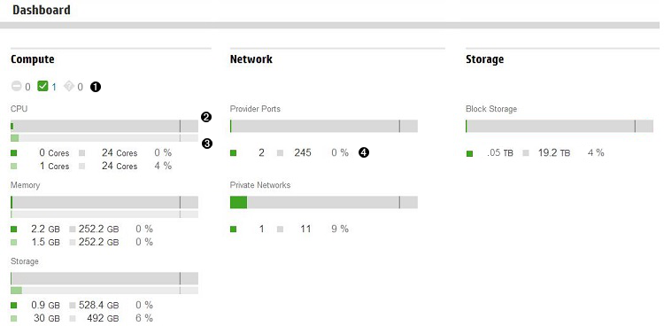
The graphs in the top section of the Dashboard display the most important components of compute, network and storage resources, along with set of horizontal usage graphs. The graphs display the resource pool for the entire group of compute nodes, networks or storage resources.
|
Status icons are available under the Compute section heading. The icons show the combined status of all compute nodes. Click a status icon to navigate to the Compute Node overview screen in the console. |
|
|
Physical usage graphs provide a visual representation of the physical resource consumed within the last five minutes. |
|
|
Allocation graphs appear directly below the physical usage graphs. These graphs provide a visual representation of the virtual amount of the resource designated for use, where the maximum amount is the physical amount multiplied by the oversubscription rate. See Calculating the number of instances that can be provisioned to a compute node. |
|
|
Numeric indicators display in two rows under the horizontal graphs.
|


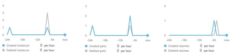
The bottom section of the Dashboard contains graphs that track the create and delete activities of the components that consume the resources. The graph represents activity over a 24-hour period. The values below the graph change as you hover left to right over the graph. The blue graph line represents all created components and the gray line represents all deleted components.
See also Interpreting the Dashboard data
Status icons
The compute status icons link back to the Compute Node screen. You can click the status icons to navigate away from the Dashboard to the Compute Node overview screen. Status indicators show when a compute node is in one of the following states: OK (![]() ),
), Warning (![]() ), or
), or Error (![]() ).
).
If no resources are defined or if no resource instances are detected with a particular status (indicated by the number zero), the associated icon is nearly colorless (very pale gray).
Graphs
Dashboard graph colors provide a quick way to visually interpret the data being reported.
Dashboard graph colors
| Color | Indication |
|---|---|
| Green | A healthy status |
| Yellow | An event has occurred that might require your attention |
| Red | A critical condition that requires your immediate attention |
| Light gray | The remainder of resource instances that do not match the data being measured |
| Dark gray | Resource instances reporting status other than OK, Warning, or Error, that is, they are Disabled or Unknown |