Flows Dashboard Basics
Estimated reading time: 7 minutes
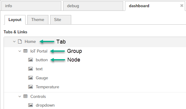
Identify Dashboard Elements
Prerequisite
These procedures for creating flow dashboards assume that you already have worked with flows. See OT Link Platform Flows.
Flows offers easy drag-and-drop dashboard construction, but before you get started, it is useful to understand the elements used to create a dashboard.
| Dashboard Element | Description | |
|---|---|---|
| 1 | Tab | A dashboard can have multiple tabs, which enable navigation to different pages. |
| 2 | Group | Use a group as a building block to organize display nodes on a page. In a web UI context, this grouping often is referred to as a portlet. |
| 3 | Nodes | Drag Dashboard Nodes onto the Canvas and designate the tab and group to which the nodes will belong. |
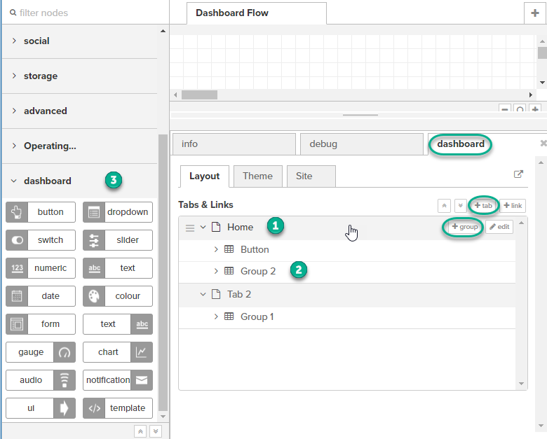
For an overview of these dashboard elements, go to the upper right actions icon  and select View > Dashboard. Then, click the Layout tab to view the dashboard configuration below the canvas.
|
Example of Dashboard Layout View
The + tab, + link, + group, and edit tabs in the dashboard layout view are visible only when you mouse over the tab/group row. |
Example of Basic Flow Dashboard Elements
|
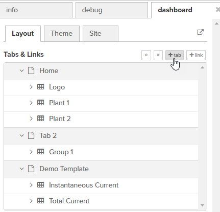
Add or Edit a Tab
The easiest way to add or edit a dashboard tab is via the sidebar dashboard tab.
Add a Tab
- In the upper right actions list, select View > Dashboard. Then, click Layout.
-
Simply click + tab and a new tab will be created.
- In the Flows main canvas view, click Save.
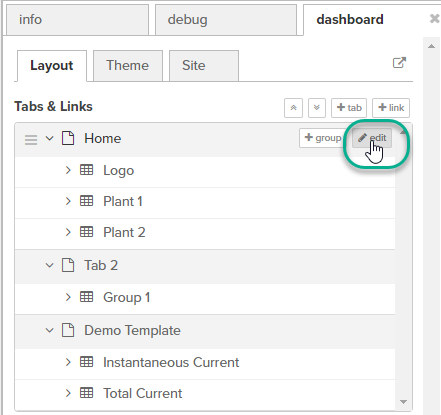
Rename a Tab
-
In the dashboard layout view, mouse over the tab row and click edit.
-
Modify the name and/or icon and click Update.
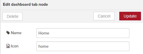
-
In the Flows main canvas view, click Save.
Change a Tab Icon
Tab icons can be modified by selecting alternate icons from these sources:
To use a different tab icon:
- Mouse over the tab row and click edit.
- Enter the name of the icon (found in the sources listed above), such as
check_circleorhome. - Click Update.
- Be sure to click Save.

Add or Edit a Group
The easiest way to add or edit a dashboard group is via the sidebar dashboard view.
Add a Group
- In the upper right actions list, select View > Dashboard. Then, click Layout.
- Select a tab and click + group. A new group will be created.
- In the Flows main canvas view, click Save.
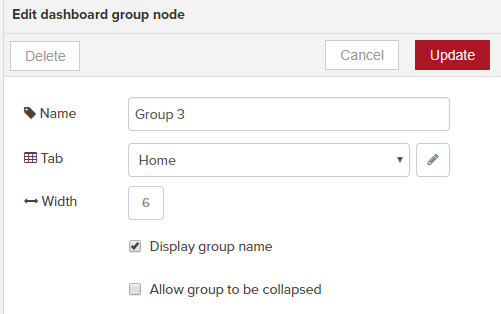
Edit a Group
- In the dashboard layout view, mouse over the group row and click edit.
- Modify the Name and/or the Tab to which the group should belong.
- Click Update.
- In the Flows main canvas view, click Save.
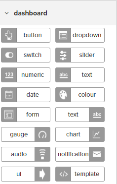
Drag Dashboard Nodes onto the Canvas
The Flows dashboard palette includes the following nodes, which when dragged onto a canvas, become widgets in a dashboard. These nodes enable you to build a dashboard with common elements, such as buttons, dropdown lists, and charts. When you combine these nodes with data collection flows, you can monitor sensor data in a single-pane-of-glass view.
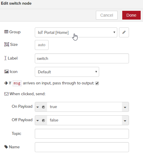
Configure a Dashboard Node
When you add a dashboard node to the canvas, you must double-click it to configure its settings. Most of the dashboard nodes must be assigned to a dashboard Group, as shown in the following example.
Customize Message Text Colors
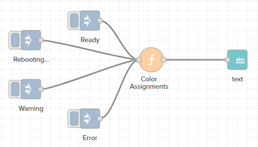
There may be times when you want to assign colors to displayed messages, particularly when monitoring device status. The following example illustrates how to configure a flow and dashboard to change the message color based on the device status: Ready, Rebooting, Warning, or Error.
|
|
|
For your convenience, the following code can be copied and imported into Flows so that you can explore the configuration.
- Copy the following code block to the clipboard.
- In Flows, import from the clipboard. See also, Export and Import Flows.
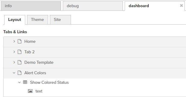
[{"id":"7b889445.29cbfc","type":"ui_text","z":"21b9c2dc.7bf46e","group":"f7e07b80.a8b2c8","order":0,"width":"0","height":"0","name":"","label":"","format":"<font color= > </font>","layout":"col-center","x":640,"y":220,"wires":[]},{"id":"4b8181b0.ec8ab","type":"inject","z":"21b9c2dc.7bf46e","name":"","topic":"","payload":"Ready","payloadType":"str","repeat":"","crontab":"","once":false,"x":340,"y":140,"wires":[["435cd506.e398bc"]]},{"id":"435cd506.e398bc","type":"function","z":"21b9c2dc.7bf46e","name":"Color Assignments","func":"switch (msg.payload) {\n\ncase \"Ready\" : \n msg.color = \"lime\";\n break;\n \ncase \"Warning\" : \n msg.color = \"orange\";\n break;\n \ncase \"Rebooting...\" : \n msg.color = \"blue\";\n break;\n \ndefault : \n msg.color = \"red\";\n break;\n}\n\nreturn msg;","outputs":1,"noerr":0,"x":465,"y":220,"wires":[["7b889445.29cbfc"]]},{"id":"f3fc7605.077428","type":"inject","z":"21b9c2dc.7bf46e","name":"","topic":"","payload":"Warning","payloadType":"str","repeat":"","crontab":"","once":false,"x":220,"y":280,"wires":[["435cd506.e398bc"]]},{"id":"37d6f0de.eb7e9","type":"inject","z":"21b9c2dc.7bf46e","name":"","topic":"","payload":"Rebooting...","payloadType":"str","repeat":"","crontab":"","once":false,"x":220,"y":180,"wires":[["435cd506.e398bc"]]},{"id":"29b7a81c.d345c8","type":"inject","z":"21b9c2dc.7bf46e","name":"","topic":"","payload":"Error","payloadType":"str","repeat":"","crontab":"","once":false,"x":340,"y":340,"wires":[["435cd506.e398bc"]]},{"id":"f7e07b80.a8b2c8","type":"ui_group","z":"","name":"Show Colored Status","tab":"55213901.3e2a88","disp":false,"width":"6","collapse":false},{"id":"55213901.3e2a88","type":"ui_tab","z":"","name":"Alert Colors","icon":"dashboard"}]
| Nodes | Steps to configure the nodes and dashboard | |
|---|---|---|
| Inject |
|
This node can be found in the Input list. This node is used primarily to demonstrate this functionality. In a production environment, device messages would need to be parsed to extract status values.
|
| Function |
|
This node can be found in the Function list. Use this node to assign a color to each status message.
|
| Text |
|
This ui_text node can be found in the Dashboard list. Note that there are two text nodes in the Dashboard list. This is not the text input field.
|


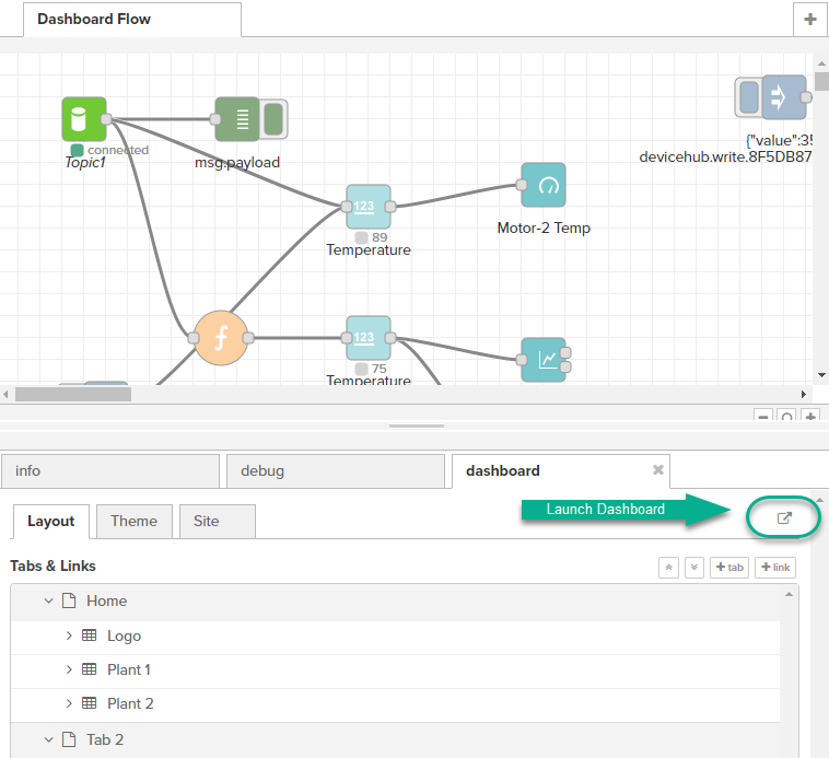
Launch the Flow Dashboard
Once the dashboard elements have been configured, you can review the results in the dashboard. See Identify Dashboard Elements
In the dashboard tab, click the launch icon at the upper right of the sidebar dashboard view, displayed below the canvas.
The URL for the dashboard will have the format for your IP address: https://nnn.nnn.nnn.nnn/flows/api/ui/#/0
Create a Flows Dashboard: