Customize the Flows View
Estimated reading time: 1 minute
Several options enable customization of the flows view.
Click the list icon ( ≡ ) at the top right of the Flows window.
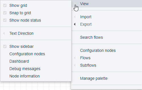
The following options can be toggled on and off via ≡ > View:
Show grid: Grid displays by default. Toggle the option to remove the grid lines.
Snap to grid: Snap to grid is enabled by default. Toggle the option to disable/enable alignment of nodes with grid lines.
Show node status: The publish and subscribe nodes, for example, display status such as connected or waiting for message. Toggle the option to disable/enable the status.
Show sidebar: Actually, the sidebar in the Flows window is beneath the canvas. Best practices recommend keeping this message display area enabled. The sidebar includes the tabs:
- Info: Description of a selected node and its functionality. This tab is always enabled.
- Debug: Messages that can be used to verify a flow’s logic. This tab is always enabled.
- Dashboard: User-configured dashboard of the flow logic. Enable this tab with ≡ > View > Dashboard.
- Config: Nodes that are used/unused in flows. Enable this tab with ≡ > Configuration nodes.
Text Direction: Configure the way text will appear in node fields, when configuring or editing a node.
- Default: Left-to-right text.
- Left-to-right: As you type, the text will be appended to the left-justified text string.
- Right-to-left: As you type, the text will be appended to the right-justified text string.
- Contextual: Text direction is determined by the type and shape of the node.